Note
Click here to download the full example code
Plotting contour subplots with different colour maps/scales
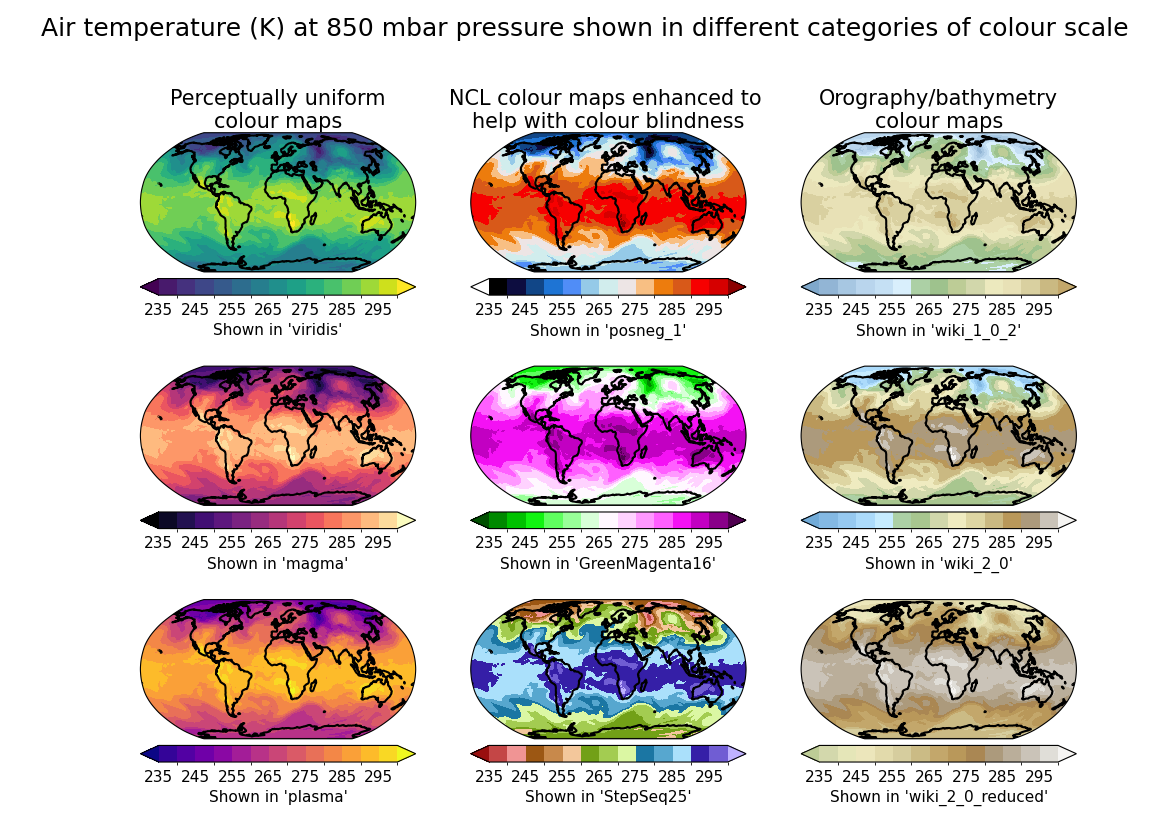
In this recipe, we will plot the same data with different colour maps from three categories in separate subplots to illustrate the importance of choosing a suitable one for given data. To avoid unintended bias and misrepresentation, or lack of accessibility, a careful choice must be made.
Import cf-python and cf-plot:
import matplotlib.pyplot as plt
import cfplot as cfp

import cf
Read the field in:
3. Choose a set of predefined colour scales to view. These can be chosen from the selection at: https://ncas-cms.github.io/cf-plot/build/colour_scales.html or you can define your own, see: https://ncas-cms.github.io/cf-plot/build/colour_scales.html#user-defined-colour-scales. Here we take three colour scales each from three different general categories, to showcase some differences in representation. Note colour scale levels can be adjusted using ‘cscale’ and keywords such as: cfp.cscale(<cmap name>, ncols=16, below=2, above=14)
a. Perceptually uniform colour scales, with no zero value, see: https://ncas-cms.github.io/cf-plot/build/colour_scales.html#perceptually-uniform-colour-scales.
colour_scales_pu = ["viridis", "magma", "plasma"]
b. NCAR Command Language colour scales enhanced to help with colour blindness, see: https://ncas-cms.github.io/cf-plot/build/colour_scales.html#ncar-command-language-enhanced-to-help-with-colour-blindness. These colour maps are better for accessibility.
colour_scales_ncl = ["posneg_1", "GreenMagenta16", "StepSeq25"]
c. Orography/bathymetry colour scales, see: https://ncas-cms.github.io/cf-plot/build/colour_scales.html#orography-bathymetry-colour-scales. These are used to show the shape/contour of land masses, but bear in mind the data we show here is air temperature so doesn’t represent this and therefore it is not a good choice in this case:
colour_scales_ob = ["wiki_1_0_2", "wiki_2_0", "wiki_2_0_reduced"]
4. We plot each category of colourmap in a given columns of the subplot, but given the ‘gpos’ function positions subplots from left to right, row by row from the top, we need to interleave the values in a list. We can use zip to do this:
colour_scales_columns = [
    cscale
    for category in zip(colour_scales_pu, colour_scales_ncl, colour_scales_ob)
    for cscale in category
]
5. Create the figure and give it an overall title. Ensure the number of rows * number of columns = number of colour scales. Then we loop through all the different colour maps defined and plot as subplots, with each category in the same column, labelling each column with the colour scale category:
cfp.gopen(rows=3, columns=3, bottom=0.1, top=0.85)
plt.suptitle(
    (
        "Air temperature (K) at 850 mbar pressure shown in different "
        "categories of colour scale"
    ),
    fontsize=18,
)
for i, colour_scale in enumerate(colour_scales_columns):
    cfp.gpos(i + 1)
    cfp.cscale(colour_scale, ncols=15)

    # For the topmost plots, label the column with the colour scale category
    # using the 'title' argument, otherwise don't add a title.
    # Ensure the order the titles are written in corresponds to the
    # order unzipped in step 4, so the columns match up correctly.
    if i == 0:
        set_title = "Perceptually uniform\ncolour maps"
    elif i == 1:
        set_title = "NCL colour maps enhanced to \nhelp with colour blindness"
    elif i == 2:
        set_title = "Orography/bathymetry\ncolour maps"
    else:
        set_title = ""

    cfp.con(
        f.subspace(pressure=850),
        title=set_title,
        lines=False,
        axes=False,
        colorbar_drawedges=False,
        colorbar_title=f"Shown in '{colour_scale}'",
        colorbar_fraction=0.04,
        colorbar_thick=0.02,
        colorbar_fontsize=11,
    )
cfp.gclose()
Total running time of the script: ( 0 minutes 7.351 seconds)