Note
Click here to download the full example code
Plotting per-season trends in global sea surface temperature extrema
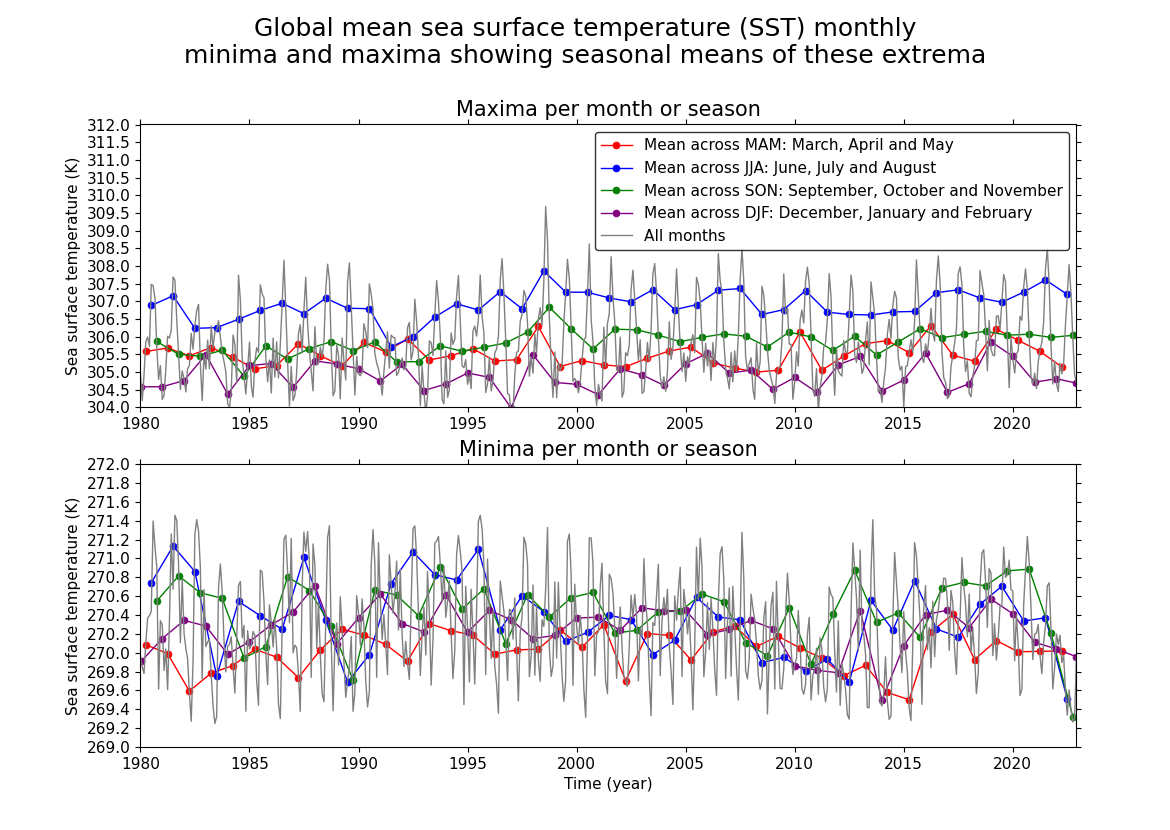
In this recipe we find the area-based extrema of global sea surface temperature per month and, because it is very difficult to interpret for trends when in a monthly form, we calculate and plot on top of this the mean across each season for both the minima and the maxima.
Import cf-python, cf-plot and other required packages:
import matplotlib.pyplot as plt
import cfplot as cfp

import cf
Read the dataset in extract the SST Field from the FieldList:
Collapse the SST data by area extrema (extrema over spatial dimensions):
am_max = sst.collapse("area: maximum")  # equivalent to "X Y: maximum"
am_min = sst.collapse("area: minimum")  # equivalent to "X Y: minimum"
4. Reduce all timeseries down to just 1980+ since there are some data quality issues before 1970 and also this window is about perfect size for viewing the trends without the line plot becoming too cluttered:
am_max = am_max.subspace(T=cf.ge(cf.dt("1980-01-01")))
am_min = am_min.subspace(T=cf.ge(cf.dt("1980-01-01")))
5. Create a mapping which provides the queries we need to collapse on the four seasons, along with our description of them, as a value, with the key of the string encoding the colour we want to plot these trend lines in. This structure will be iterated over to make our plot:
colours_seasons_mapping = {
    "red": (cf.mam(), "Mean across MAM: March, April and May"),
    "blue": (cf.jja(), "Mean across JJA: June, July and August"),
    "green": (cf.son(), "Mean across SON: September, October and November"),
    "purple": (cf.djf(), "Mean across DJF: December, January and February"),
}
6. Create and open the plot file. Put maxima subplot at top since these values are higher, given increasing x axis. Note we set limits manually with ‘gset’ only to allow space so the legend doesn’t overlap the data, which isn’t possible purely from positioning it anywhere within the default plot. Otherwise cf-plot handles this for us. To plot the per-season means of the maxima, we loop through the season query mapping and do a “T: mean” collapse setting the season as the grouping:
cfp.gopen(
    rows=2, columns=1, bottom=0.1, top=0.85,
)
cfp.gpos(1)
cfp.gset(xmin="1980-01-01", xmax="2022-12-01", ymin=304, ymax=312)
for colour, season_query in colours_seasons_mapping.items():
    query_on_season, season_description = season_query
    am_max_collapse = am_max.collapse("T: mean", group=query_on_season)
    cfp.lineplot(
        am_max_collapse,
        color=colour,
        markeredgecolor=colour,
        marker="o",
        label=season_description,
        title="Maxima per month or season",
    )
cfp.lineplot(
    am_max,
    color="grey",
    xlabel="",
    label="All months",
)
# Create and add minima subplot below the maxima one. Just like for the
# maxima case, we plot per-season means by looping through the season query
# mapping and doing a "T: mean" collapse setting the season as the grouping
cfp.gpos(2)
cfp.gset(xmin="1980-01-01", xmax="2022-12-01", ymin=269, ymax=272)
for colour, season_query in colours_seasons_mapping.items():
    query_on_season, season_description = season_query
    am_min_collapse = am_min.collapse("T: mean", group=query_on_season)
    cfp.lineplot(
        am_min_collapse,
        color=colour,
        markeredgecolor=colour,
        marker="o",
        xlabel="",
        title="Minima per month or season",
    )
cfp.lineplot(
    am_min,
    color="grey",
)
# Add an overall title to the plot and close the file to save it
plt.suptitle(
    "Global mean sea surface temperature (SST) monthly\nminima and maxima "
    "showing seasonal means of these extrema",
    fontsize=18,
)
cfp.gclose()
Total running time of the script: ( 4 minutes 38.032 seconds)