Note
Click here to download the full example code
Calculate and plot the Niño 3.4 Index
In this recipe, we will calculate and plot the sea surface temperature (SST) anomaly in the Niño 3.4 region. According to NCAR Climate Data Guide, the Niño 3.4 anomalies may be thought of as representing the average equatorial SSTs across the Pacific from about the dateline to the South American coast. The Niño 3.4 index typically uses a 5-month running mean, and El Niño or La Niña events are defined when the Niño 3.4 SSTs exceed +/- 0.4 degrees Celsius for a period of six months or more.
Import cf-python and cf-plot:
import cfplot as cfp

import cf
Read and select the SST by index and look at its contents:
Field: long_name=Sea surface temperature (ncvar%sst)
----------------------------------------------------
Data            : long_name=Sea surface temperature(long_name=time(996), long_name=latitude(721), long_name=longitude(1440)) K
Dimension coords: long_name=time(996) = [1940-01-01 00:00:00, ..., 2022-12-01 00:00:00] gregorian
                : long_name=latitude(721) = [90.0, ..., -90.0] degrees_north
                : long_name=longitude(1440) = [0.0, ..., 359.75] degrees_east
Set the units from Kelvin to degrees Celsius:
4. SST is subspaced for the Niño 3.4 region (5N-5S, 170W-120W) and as the dataset is using longitudes in 0-360 degrees East format, they are subtracted from 360 to convert them:
region = sst.subspace(X=cf.wi(360 - 170, 360 - 120), Y=cf.wi(-5, 5))
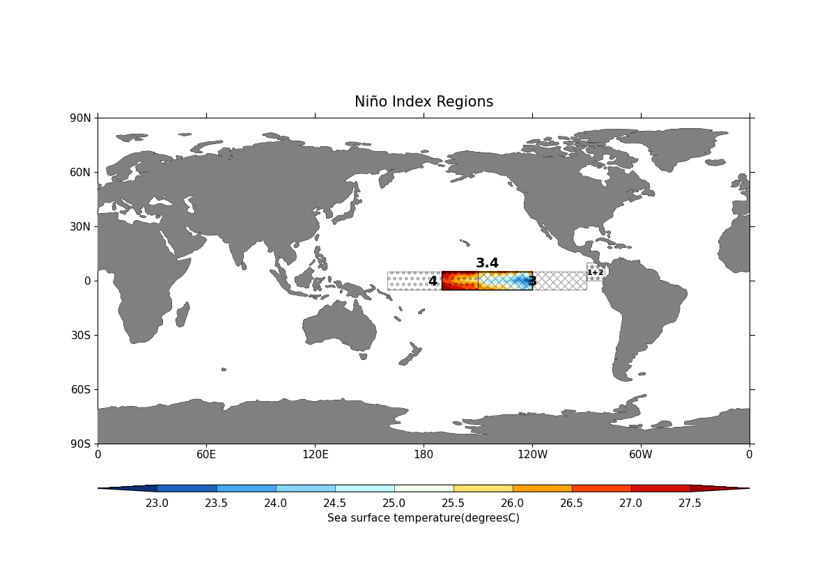
Plot the various Niño regions using cf-plot. Here:
cfplot.gopen is used to define the parts of the plot area, which is closed by cfplot.gclose;
cfplot.mapset is used to set the map limits and projection;
cfplot.setvars is used to set various attributes of the plot, like setting the land colour to grey;
cfplot.cscale is used to choose one of the colour maps amongst many available;
cfplot.con plots contour data from the
regionsubspace at a specific time with no contour lines and a title;next, four Niño regions and labels are defined using Matplotlib’s Rectangle and Text function with cf-plot plot object (
cfp.plotvars.plot):
import cartopy.crs as ccrs
import matplotlib.patches as mpatches

cfp.gopen()
cfp.mapset(proj="cyl", lonmin=0, lonmax=360, latmin=-90, latmax=90)
cfp.setvars(land_color="grey")
cfp.cscale(scale="scale1")
cfp.con(
    region.subspace(T=cf.dt(2022, 12, 1, 0, 0, 0, 0)),
    lines=False,
    title="Niño Index Regions",
)

# Niño 3.4 region(5N-5S, 170W-120W):
rectangle = mpatches.Rectangle(
    (-170, -5),
    50,
    10,
    fill=False,
    linewidth=1,
    edgecolor="black",
    transform=ccrs.PlateCarree(),
)
cfp.plotvars.mymap.add_patch(rectangle)
cfp.plotvars.mymap.text(
    -145,
    7,
    "3.4",
    horizontalalignment="center",
    fontsize=14,
    weight="bold",
    transform=ccrs.PlateCarree(),
)

# Niño 1+2 region (0-10S, 90W-80W):
rectangle = mpatches.Rectangle(
    (-90, 0),
    10,
    10,
    hatch="**",
    fill=False,
    linewidth=1,
    edgecolor="black",
    alpha=0.3,
    transform=ccrs.PlateCarree(),
)
cfp.plotvars.mymap.add_patch(rectangle)
cfp.plotvars.mymap.text(
    -85,
    3,
    "1+2",
    horizontalalignment="center",
    fontsize=8,
    weight="bold",
    transform=ccrs.PlateCarree(),
)

# Niño 3 region (5N-5S, 150W-90W):
rectangle = mpatches.Rectangle(
    (-150, -5),
    60,
    10,
    hatch="xxx",
    fill=False,
    linewidth=1,
    edgecolor="black",
    alpha=0.3,
    transform=ccrs.PlateCarree(),
)
cfp.plotvars.mymap.add_patch(rectangle)
cfp.plotvars.mymap.text(
    -120,
    -3,
    "3",
    horizontalalignment="center",
    fontsize=14,
    weight="bold",
    transform=ccrs.PlateCarree(),
)

# Niño 4 region (5N-5S, 160E-150W):
rectangle = mpatches.Rectangle(
    (-200, -5),
    50,
    10,
    hatch="oo",
    fill=False,
    linewidth=1,
    edgecolor="black",
    alpha=0.3,
    transform=ccrs.PlateCarree(),
)
cfp.plotvars.mymap.add_patch(rectangle)
cfp.plotvars.mymap.text(
    -175,
    -3,
    "4",
    horizontalalignment="center",
    fontsize=14,
    weight="bold",
    transform=ccrs.PlateCarree(),
)
cfp.gclose()
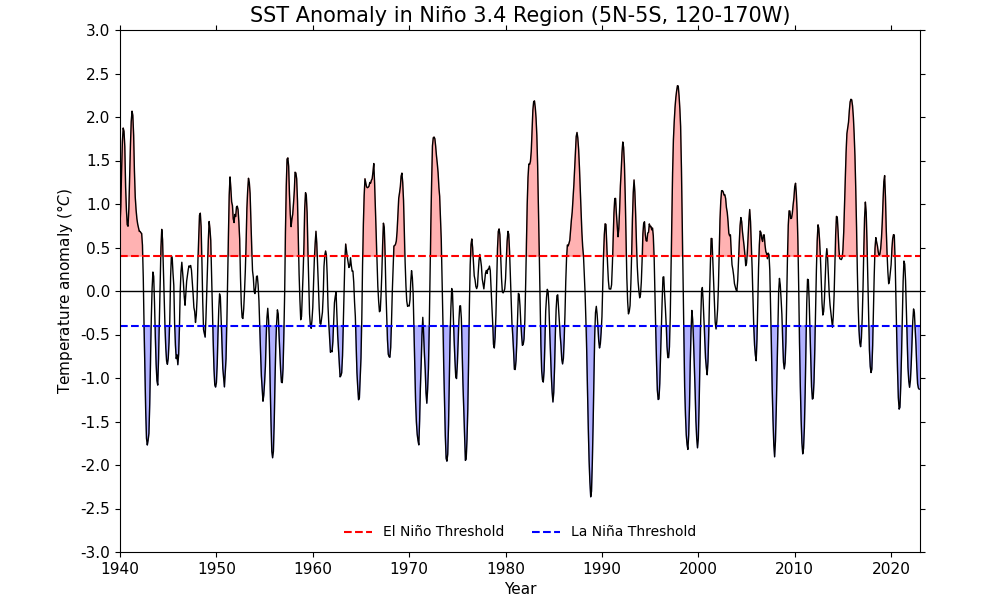
6. Calculate the Niño 3.4 index and standardize it to create an anomaly index. The collapse method is used to calculate the mean over the longitude (X) and latitude (Y) dimensions:
nino34_index = region.collapse("X: Y: mean")
7. The result, nino34_index, represents the average SST in the defined
Niño 3.4 region for each time step. In the variable base_period,
nino34_index is subset to only include data from the years 1961 to 1990.
This period is often used as a reference period for calculating anomalies.
The variables climatology and std_dev include the mean and the
standard deviation over the time (T) dimension of the base_period data
respectively:
base_period = nino34_index.subspace(T=cf.year(cf.wi(1961, 1990)))
climatology = base_period.collapse("T: mean")
std_dev = base_period.collapse("T: sd")
8. The line for variable nino34_anomaly calculates the standardized
anomaly for each time step in the nino34_index data. It subtracts the
climatology from the nino34_index and then divides by the std_dev.
The resulting nino34_anomaly data represents how much the SST in the Niño
3.4 region deviates from the 1961-1990 average, in units of standard
deviations. This is a common way to quantify climate anomalies like El Niño
and La Niña events:
nino34_anomaly = (nino34_index - climatology) / std_dev
9. A moving average of the nino34_anomaly along the time axis, with a
window size of 5 (i.e. an approximately 5-month moving average) is calculated
using the
moving_window
method. The mode='nearest' parameter is used to specify how to pad the
data outside of the time range. The resulting nino34_rolling variable
represents a smoothed version of the nino34_anomaly data. It removes
short-term fluctuations and highlights longer-term trends or cycles:
nino34_rolling = nino34_anomaly.moving_window(
    method="mean", window_size=5, axis="T", mode="nearest"
)
10. Define El Niño and La Niña events by creating Boolean masks to identify El Niño and La Niña events. Now plot SST anomalies in the Niño 3.4 region over time using cf-plot. Here:
cfplot.gset sets the limits of the x-axis (years from 1940 to 2022) and y-axis (anomalies from -3 degrees C to 3 degrees C) for the plot;
cfplot.gopen is used to define the parts of the plot area, which is closed by cfplot.gclose;
cfplot.lineplot plots the rolling Niño 3.4 index over time;
a zero line and also horizontal dashed lines are drawn for El Niño and La Niña thresholds using Matplotlib’s axhline with cf-plot plot object (
cfp.plotvars.plot);fill_between from Matplotlib is used with cf-plot plot object (
cfp.plotvars.plot) to fill the area between the Niño 3.4 index and the El Niño/La Niña thresholds;similarly, cfplot.plotvars.plot.legend is used to add a legend in the end:
elnino = nino34_rolling >= 0.4
lanina = nino34_rolling <= -0.4

cfp.gset(xmin="1940-1-1", xmax="2022-12-31", ymin=-3, ymax=3)

cfp.gopen(figsize=(10, 6))
cfp.lineplot(
    nino34_rolling,
    color="black",
    title="SST Anomaly in Niño 3.4 Region (5N-5S, 120-170W)",
    ylabel="Temperature anomaly ($\degree C$)",
    xlabel="Year",
)
cfp.plotvars.plot.axhline(
    0.4, color="red", linestyle="--", label="El Niño Threshold"
)
cfp.plotvars.plot.axhline(
    -0.4, color="blue", linestyle="--", label="La Niña Threshold"
)
cfp.plotvars.plot.axhline(0, color="black", linestyle="-", linewidth=1)
cfp.plotvars.plot.fill_between(
    nino34_rolling.coordinate("T").array,
    0.4,
    nino34_rolling.array.squeeze(),
    where=elnino.squeeze(),
    color="red",
    alpha=0.3,
)
cfp.plotvars.plot.fill_between(
    nino34_rolling.coordinate("T").array,
    -0.4,
    nino34_rolling.array.squeeze(),
    where=lanina.squeeze(),
    color="blue",
    alpha=0.3,
)
cfp.plotvars.plot.legend(frameon=False, loc="lower center", ncol=2)
cfp.gclose()
Total running time of the script: ( 5 minutes 17.754 seconds)