Line plots i.e. graphs#
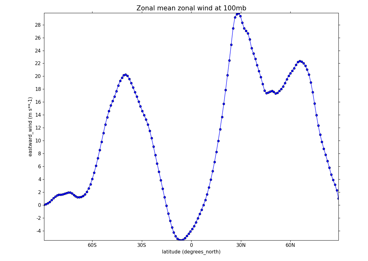
Example 27: Basic line plot#
fl = cf.read(f"{self.data_dir}/ggap.nc")
f = fl.select_by_identity("eastward_wind")[0]

g = f.collapse("X: mean")

cfp.gopen()
cfp.lineplot(
    g.subspace(pressure=100),
    marker="o",
    color="blue",
    title="Zonal mean zonal wind at 100mb",
)
cfp.gclose()
Note other valid markers are:
Example 28: Line plot with a legend#
fl = cf.read(f"{self.data_dir}/ggap.nc")
f = fl.select_by_identity("eastward_wind")[0]

g = f.collapse("X: mean")

xticks = [-90, -75, -60, -45, -30, -15, 0, 15, 30, 45, 60, 75, 90]
xticklabels = [
    "90S",
    "75S",
    "60S",
    "45S",
    "30S",
    "15S",
    "0",
    "15N",
    "30N",
    "45N",
    "60N",
    "75N",
    "90N",
]
xpts = [-30, 30, 30, -30, -30]
ypts = [-8, -8, 5, 5, -8]

cfp.gset(xmin=-90, xmax=90, ymin=-10, ymax=50)

cfp.gopen()
cfp.lineplot(
    g.subspace(pressure=100),
    marker="o",
    color="blue",
    title="Zonal mean zonal wind",
    label="100mb",
)
cfp.lineplot(
    g.subspace(pressure=200),
    marker="D",
    color="red",
    label="200mb",
    xticks=xticks,
    xticklabels=xticklabels,
    legend_location="upper right",
)
cfp.plotvars.plot.plot(xpts, ypts, linewidth=3.0, color="green")
cfp.plotvars.plot.text(
    35, -2, "Region of interest", horizontalalignment="left"
)
cfp.gclose()
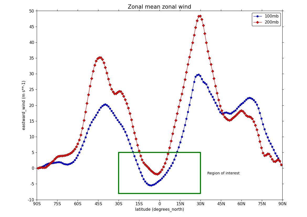
The cfp.plotvars.plot object contains the matplotlib plot and will accept
normal Matplotlib plotting commands. As an example of this the following
code within a cfp.gopen() and cfp.gclose() construct will make a
legend that is independent of any previously made lines and attached labels.
Valid locations for the legend_location keyword are:
When making a call to lineplot the following parameters overide any predefined CF defaults:
Example 29: Time series line plot#
f = cf.read(f"cfplot_data/tas_A1.nc")[0]

temp = f.subspace(time=cf.wi(cf.dt("1900-01-01"), cf.dt("1980-01-01")))
temp_annual = temp.collapse("T: mean", group=cf.Y())
temp_annual_global = temp_annual.collapse("area: mean", weights="area")
temp_annual_global.Units -= 273.15

cfp.lineplot(
    temp_annual_global,
    title="Global average annual temperature",
    color="blue",
)
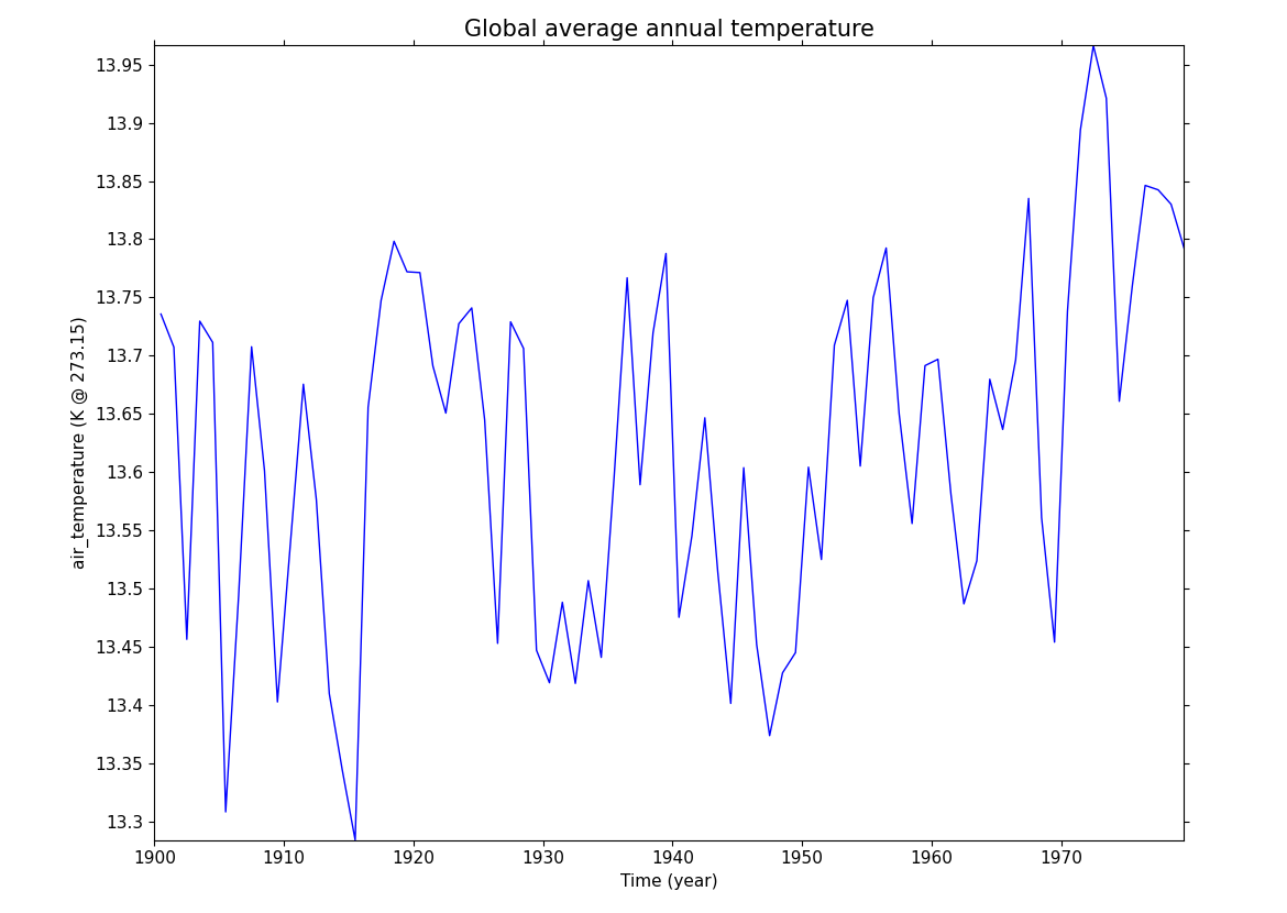
In this example we subset a time data series of global temperature, area mean the data, convert to Celsius and plot a linegraph.
When using gset to set the limits on the plotting axes and a time axis
pass time strings to give the limits i.e.
cfp.gset(xmin='1980-1-1', xmax='1990-1-1', ymin=285, ymax=295)
The correct date format is YYYY-MM-DD or YYYY-MM-DD HH:MM:SS.
Anything else will give unexpected results.
Example 30: Line plot with two x axes#
tol = cf.RTOL(1e-5)

fl = cf.read(f"cfplot_data/ggap.nc")

f = fl.select_by_identity("eastward_wind")[0]
u = f.collapse("X: mean")
u1 = u.subspace(Y=cf.isclose(-61.12099075))
u2 = u.subspace(Y=cf.isclose(0.56074494))

g = fl.select_by_identity("air_temperature")[0]
t = g.collapse("X: mean")
t1 = t.subspace(Y=cf.isclose(-61.12099075))
t2 = t.subspace(Y=cf.isclose(0.56074494))

cfp.gopen()
cfp.gset(-30, 30, 1000, 0)
cfp.lineplot(u1, color="r")
cfp.lineplot(u2, color="r")
cfp.gset(190, 300, 1000, 0, twiny=True)
cfp.lineplot(t1, color="b")
cfp.lineplot(t2, color="b")
cfp.gclose()
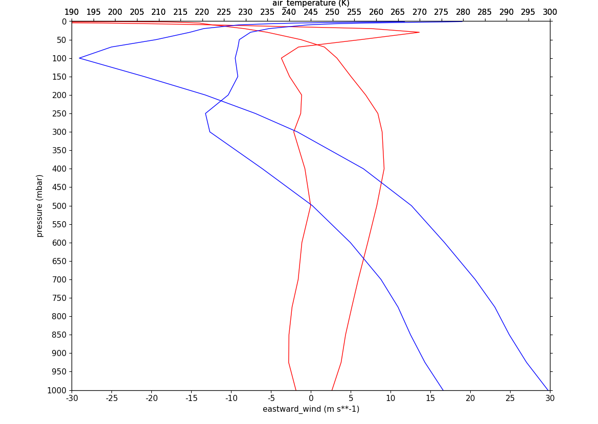
In this example we plot two x-axes, one with zonal mean zonal wind data
and one with temperature data. The option for a twin x-axis is
twiny=True. This is a matplotlib
keyword which has been adopted within the cf-plot code.