Stipple plots#
Example 17: Basic stipple plot#
A stipple plot, whereby stippling is applied to a contour
plot to indicate areas of statistical significance.#
f = cf.read(f"cfplot_data/tas_A1.nc")[0]

g = f.subspace(time=15)

cfp.gopen()
cfp.cscale("magma")
cfp.con(g)
cfp.stipple(f=g, min=220, max=260, size=100, color="#00ff00")
cfp.stipple(
    f=g, min=300, max=330, size=50, color="#0000ff", marker="s"
)
cfp.gclose()
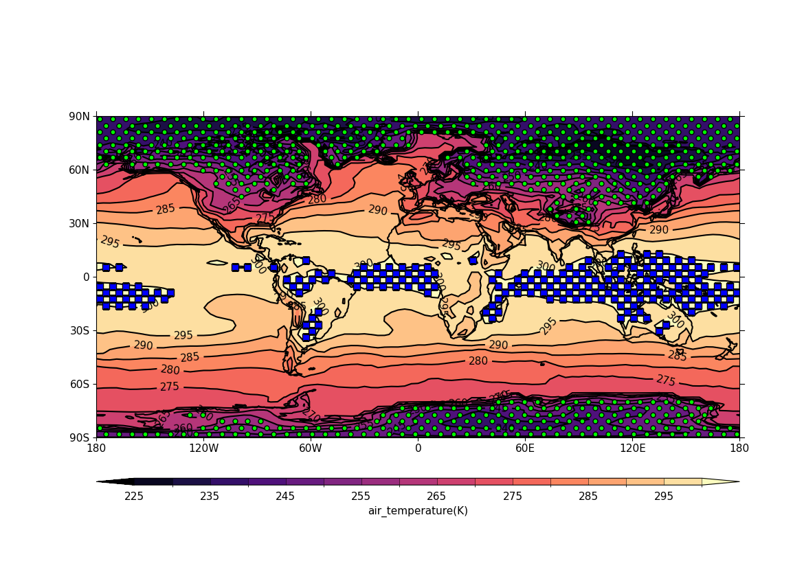
Stipple plots are usually used to display significance. The above is a plot with a temperature field stippled between two different limits. A contour field is displayed underneath to show that the stippling is in the correct regions.
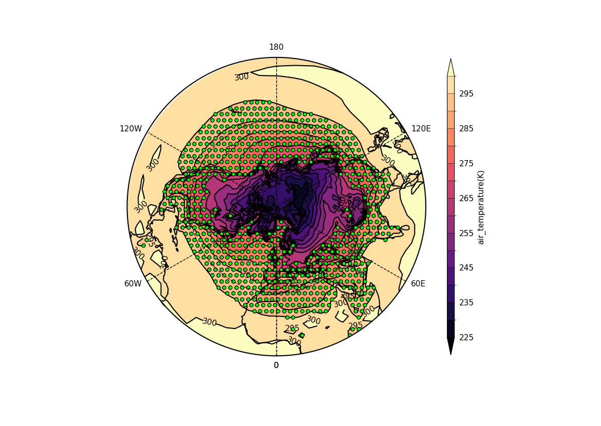
Example 18: Polar stipple plot#
A stipple plot in the North Pole polar stereographic projection.#
f = cf.read(f"cfplot_data/tas_A1.nc")[0]

g = f.subspace(time=15)

cfp.gopen()
cfp.cscale("magma")
cfp.mapset(proj="npstere")
cfp.con(g)
cfp.stipple(f=g, min=265, max=295, size=100, color="#00ff00")
cfp.gclose()